Ever sat down to sketch a quick dining scene and realized the fork looks like it’s floating or the plate is somehow an oval from a different dimension? It happens to the best of us. Drawing a dinner setting—what most call a set the table drawing—is actually a classic exercise in perspective and spatial awareness. It’s one of those things that seems easy until you’re staring at a blank piece of paper trying to figure out where the bread plate goes without making the whole composition look cluttered.
Actually, it's kinda funny. We see these layouts every single day. We live them. But the moment we try to translate that three-dimensional reality into a 2D sketch, our brains sort of scramble the signal.
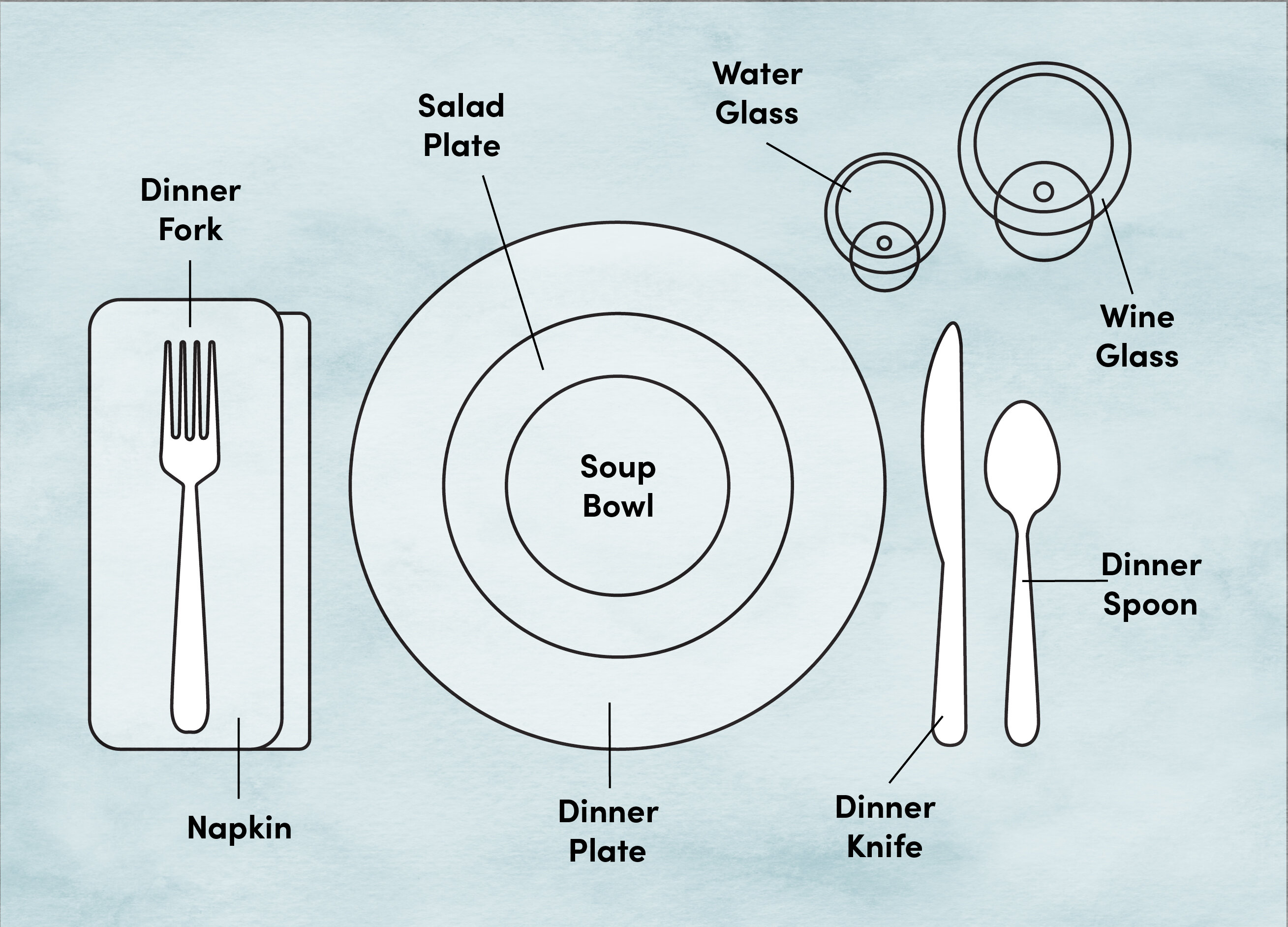
The Geometry of a Simple Set the Table Drawing
The biggest hurdle is the ellipse. Most people draw plates as circles because, well, they are circles. But unless you’re drawing a bird’s-eye view from the ceiling, that plate is going to look like a squashed oval. If you get the ellipse wrong, the whole set the table drawing feels "flat" or tilted.
Start with a light horizontal line. This is your guide. You want to sketch the plate as a wide, shallow ellipse. If you’re doing a formal setting, you’ll have a "charger" (that big decorative plate) and then a smaller dinner plate inside it. Don't just draw two circles. Space them out. The gap between the inner and outer ellipse should be wider at the sides than at the top and bottom. That’s just how physics works.
Fork, Knife, and Spoon Placement
Knives are tricky. You’ve got the blade facing the plate—always. If you draw it facing away, it looks aggressive or just plain wrong to anyone who’s ever been to a decent Sunday dinner. The knife and the spoon go on the right. The forks go on the left.
Wait. Why?
It’s actually a historical holdover from how we use our hands. Most people are right-handed, so the heavy lifting (cutting) happens on the right. In your set the table drawing, ensure the handles of your silverware all line up at the bottom. This "invisible baseline" is what makes a drawing look professional rather than messy.
Beyond the Basics: Formal vs. Casual Layouts
If you’re going for a fancy vibe, you’re adding more layers. This is where people usually quit because it feels like a lot of "stuff."
- The Bread Plate: This lives at the top left, roughly at the 10 o'clock position relative to the main plate.
- Water and Wine Glasses: These sit at the top right, around 2 o'clock.
- Napkin Placement: This is your chance to add texture. Don't just draw a square. Draw a few folds. Maybe tuck it under the forks or place it right in the center of the plate.
When you’re sketching these, remember that the glass is a cylinder. The base of the glass should be an ellipse that matches the "roundness" of your plate. If the plate is very flat, the glass base should be very flat. Consistency is basically the secret sauce here.
Common Mistakes That Kill the Realism
Honestly, the most common mistake is size. People draw the spoon the same size as the knife. In reality, a teaspoon is much smaller. If you make everything the same scale, it looks like a set of plastic toys. Look at your own kitchen. Grab a fork and a knife. Lay them down. See how the knife is significantly longer? Capture that.
Another thing? Tangents. In art, a tangent is when two lines just barely touch. It creates this weird tension that distracts the eye. In a set the table drawing, either leave a clear gap between the fork and the plate or have the fork clearly overlapping a tiny bit of the plate's rim. Don't let them just "kiss."
Using Shading to Create Depth
A line drawing is fine, but if you want it to pop, you need shadows. Since plates are usually white or light-colored, the shadow is what defines the shape.
- The Drop Shadow: There should be a small, dark shadow right under the edge of the plate. This "grounds" the object so it doesn't look like it's hovering in space.
- The Silverware Reflection: Silverware is reflective. You don't need to draw every detail of the room in the spoon. Just a few high-contrast streaks of dark and light will give that "metallic" look.
- Glass Transparency: This is the hard part. To make a water glass look like glass, use a very light hand. Draw the back rim slightly lighter than the front rim. Add a tiny "sparkle" or highlight with a white gel pen or an eraser.
Why Technical Accuracy Matters for Illustrators
If you’re a concept artist or a comic book creator, getting a set the table drawing right is a sign of craft. Readers might not know why a scene looks wrong, but they’ll sense it. If your character is having a high-stakes dinner and the butter knife is on the wrong side, it breaks the immersion.
According to etiquette experts like those at the Emily Post Institute, the "rules" of the table are designed for efficiency. Drawing them correctly reflects that order. It tells a story of the household. Is it a messy, lived-in kitchen? Or a stiff, formal dining room? The way you draw the setting tells the viewer who lives there.
Actionable Tips for Your Next Sketch
If you're ready to pick up a pencil, don't just wing it.
- Use a Reference: Don't guess. Set your own table, take a photo with your phone at a low angle, and draw from that.
- Start with "Ghost Lines": Draw the entire ellipse of the plate, even the parts that will be covered by the napkin or the silverware. You can erase the hidden lines later. This ensures the shape is continuous and doesn't look broken.
- Check Your Angles: If you’re drawing at an angle, the utensils on the "far side" of the plate should be slightly smaller than the ones closer to the viewer. It's subtle, but it adds that "3D" punch.
- Focus on the Negative Space: Look at the shape of the table between the fork and the plate. If that shape looks weird, the objects are probably misplaced.
Drawing a table setting isn't just about drawing forks and spoons. It's about rhythm and spacing. Once you master the ellipse and the alignment, you can apply those skills to almost any still-life subject. Start with a simple plate and a fork. Master that. Then move on to the wine glasses and the three-course finery.
The next time you’re out at a restaurant and the service is slow, grab a napkin and a pen. Practice sketching the layout in front of you. It's the best way to train your eye to see the reality of the shapes rather than what you think a table looks like.
Next Steps:
To take your set the table drawing to the next level, focus on the "contact points." Look closely at where a spoon touches the tablecloth. Notice the tiny, dark shadow right at the point of contact. Adding these "occlusion shadows" will immediately make your drawing look like it was done by a pro. Once you've nailed the graphite version, try adding a light watercolor wash to define the reflections in the glassware.