You know the image. It’s etched into the brain of every person who walked through a mall in the early 2000s. A winged soldier, stenciled in a gritty, street-art style, clutching a flag against a parchment-colored background. It wasn't just a cool drawing. Honestly, the Linkin Park Hybrid Theory cover defined an entire aesthetic for a generation of kids who felt caught between the polished world of pop and the aggressive weight of metal.
It’s iconic.
But where did it actually come from? Most people assume some high-paid agency executive sat in a boardroom and focus-grouped the "nu-metal" look. That’s not what happened. The reality is much more DIY, rooted in the band's actual history as art students and graphic designers before they were global superstars.
The Soldier With Dragonfly Wings
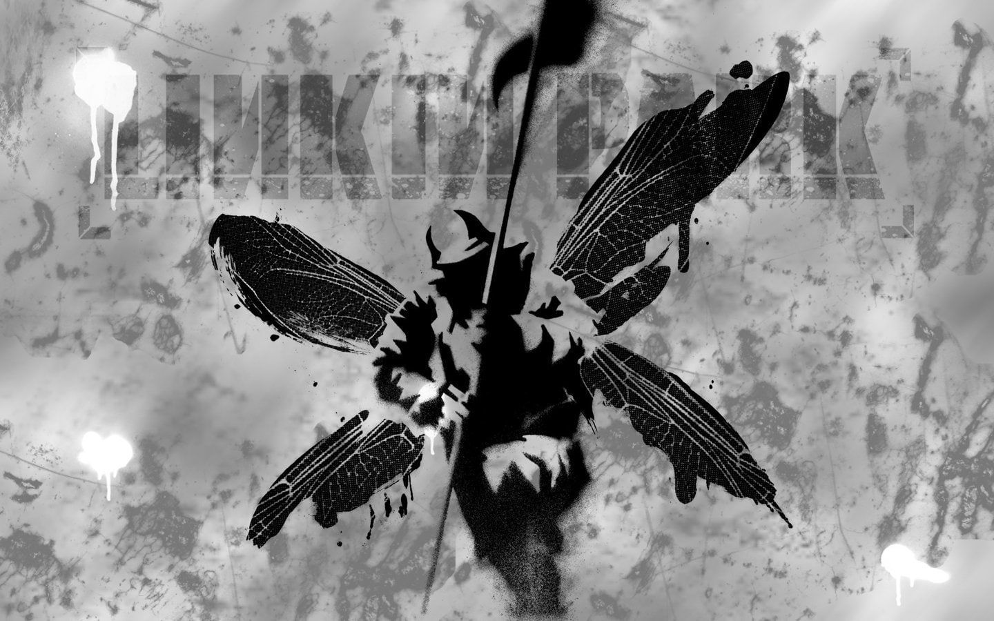
Mike Shinoda is the architect here. Before the platinum records, he was a student at the Art Center College of Design in Pasadena. He didn't just want a "cool" picture for the debut; he wanted a visual representation of the band’s sound. The name Hybrid Theory wasn't just a placeholder. It was the mission statement. They were mixing hip-hop, industrial electronic music, and rock into something that shouldn't have worked, but did.
The soldier represents the "hard" side of the band—the aggressive vocals of Chester Bennington and the heavy riffs of Brad Delson. The dragonfly wings? Those are the "soft" side. They represent the melodies, the vulnerability in the lyrics, and the atmospheric samples Joe Hahn layered into the tracks.
It’s contrast. Pure and simple.
Shinoda himself did the bulk of the work on the stencil. He’s talked about how they literally took the stencil out and sprayed it to get that authentic, messy, street-art texture. If you look closely at the original Linkin Park Hybrid Theory cover, it doesn't look like a digital file. It looks like something you'd find on a concrete wall in an alleyway. That was 100% intentional. They wanted it to feel tactile. They wanted it to feel like it belonged to the streets, not a sterile studio.
Joe Hahn also had a massive hand in the visual identity. People forget that Hahn wasn't just the DJ; he was a visual visionary who directed most of their music videos. Between Shinoda’s graphic design background and Hahn’s cinematic eye, the band had a tighter grip on their branding than almost any of their peers.
The Street Art Connection
In 2000, street art wasn't the mainstream, Banksy-in-a-museum thing it is today. It was still largely viewed as vandalism. By using a stencil style for the Linkin Park Hybrid Theory cover, the band was aligning themselves with underground culture.
The color palette is actually pretty subdued. You’ve got creams, browns, and blacks. It feels old, like a weathered document or a piece of propaganda from a war that never happened. That "soldier" isn't a specific military figure; it’s a symbol. It’s an avatar for the listener.
Some fans have spent years dissecting the flag the soldier holds. Is it a flag of surrender? A flag of conquest? In various interviews over the decades, the band has kept it somewhat ambiguous. It’s about the struggle. The lyrics on the album—songs like "Crawling" or "In the End"—deal with internal conflict. The soldier is the visual manifestation of that "internal war" people go through.
Why it worked where others failed
Think about the other covers from that era. You had Limp Bizkit with cartoonish characters or Papa Roach with high-contrast photography. Most of it feels very "of its time" now. It feels dated.
But the Hybrid Theory art has aged remarkably well. Why? Because it’s minimalist. By sticking to a simple icon, Linkin Park created a logo. It’s as recognizable as the Rolling Stones’ tongue or the Pink Floyd prism. You can draw it on a notebook in five seconds. That’s the hallmark of a great design.
The Evolution and the "Street Soldier"
The soldier didn't just stay on the first album. It became a recurring motif. If you look at the Reanimation album—the remix project that followed—the soldier was transformed into a giant, robotic, Gundam-style mech. It was a nod to the band’s love of anime and tech.
Even on the Hybrid Theory 20th Anniversary editions, the soldier remained the centerpiece. It’s the DNA of the band.
There's a specific texture to the background of the Linkin Park Hybrid Theory cover that many people miss. It’s not just a solid color. There are bits of handwritten lyrics and scribbles buried in the "dirt" of the background. It’s like a collage. Shinoda has mentioned in the past that he used to carry around journals full of these types of sketches. The cover is basically a polished version of his college notebooks.
Technical Details You Might Have Missed
The typography is worth looking at too. The "Linkin Park" font is sharp, slightly industrial, but readable. It was a departure from the "grunge" fonts that were popular in the late 90s. It felt modern. It felt like the future.
- Artist: Mike Shinoda with Joe Hahn.
- Technique: Stencil graffiti and digital compositing.
- Symbolism: The duality of aggression (soldier) and emotion (wings).
- Color Profile: Earth tones, high contrast blacks.
Warner Bros. Records initially had some notes—label executives always do—but the band fought for the creative control of their visuals. They knew that if they looked like every other "nü-metal" band with baggy pants and red caps on the cover, they’d be forgotten in two years. They wanted to be seen as artists, not just a product.
The Legacy of the Winged Soldier
When Chester Bennington passed away in 2017, the soldier took on a new meaning for fans. It became a symbol of his strength and his struggle. You’ll see it at almost every tribute show—tattoos, banners, street art. The "soldier" became Chester in the eyes of the public, even though it was designed years before they knew how big they would become.
The Linkin Park Hybrid Theory cover actually paved the way for more artistic, less "literal" covers in the heavy music scene. It proved you didn't need a photo of the band looking tough on the front to sell 10 million copies. You just needed a vibe. You needed a soul.
Honestly, if you find an original pressing of the CD, take a look at the liner notes. The whole booklet is a masterclass in early 2000s graphic design. It’s chaotic, layered, and beautiful. It captures the frantic energy of the music perfectly.
Recreating the look
If you’re a designer trying to capture this aesthetic today, it’s all about the "imperfections." You can’t get this look with a clean brush in Photoshop. You need to look for:
- High-contrast threshold filters.
- Spatter textures that mimic spray paint.
- Paper textures that look slightly "toothy" or aged.
- Distressed typography that looks like it’s been photocopied ten times.
The "Street Soldier" is a reminder that the best branding comes from the artists themselves. It wasn't a corporate mandate; it was a kid from art school trying to explain what his music felt like.
Actionable Insights for Fans and Creators
If you're looking to dive deeper into the history of this era or want to use this aesthetic, here is how you can actually engage with it:
- Watch the "Making of Hybrid Theory" documentaries: The 20th-anniversary box set includes footage of the band in their early days, often showing Mike Shinoda working on art. It's a goldmine for understanding their creative process.
- Study the Reanimation art: Compare the original soldier to the Reanimation version. It shows how a "brand icon" can evolve while keeping its core identity.
- Experiment with physical stencils: If you’re a creator, try stepping away from the screen. Cut a stencil out of cardboard, use some cheap spray paint, and scan the result. That's how you get the "Hybrid Theory" feel—not through a filter, but through the physical world.
- Check the official Linkin Park store for archival prints: They occasionally release high-quality lithographs of the original sketches. Seeing the art without the text allows you to appreciate the linework Mike and Joe put into it.
The soldier isn't just a mascot. It’s a testament to the fact that Linkin Park was always more than just a band; they were a creative collective. The cover told us exactly who they were before we even pressed play on "Papercut." It told us they were soldiers for their art, but they weren't afraid to fly.