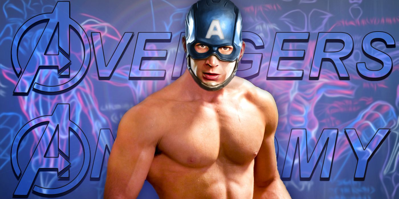
If you’ve spent more than five minutes in a comic book shop or scrolling through superhero Twitter, you’ve seen it. You know the one. It’s that 1996 image of Steve Rogers where his chest is approximately the size of a structural support beam for a skyscraper, his head looks like a tiny pebble resting on a mountain of muscle, and his profile defies every known law of human biology. Captain America bad anatomy isn't just a meme; it’s a cultural touchstone for the "extreme" era of the 1990s.
It’s honestly kind of legendary.
For years, people have dunked on Rob Liefeld for this specific drawing. It’s become the go-to example when people want to talk about how comic book art went off the rails during the Image Comics revolution. But there’s actually a lot of nuance to why that drawing exists and why the "bad anatomy" label stuck so hard to this specific era of Marvel history. It wasn't just one bad day at the drawing board. It was a perfect storm of deadlines, a specific artistic philosophy, and a complete disregard for how ribcages actually work.
The Hero Reborn Disaster
Let's set the stage. The mid-90s were a weird time for Marvel. They were facing bankruptcy, and in a desperate move, they outsourced some of their biggest characters—Captain America and the Avengers—to the guys who had left to start Image Comics. This was the "Heroes Reborn" initiative. Rob Liefeld, the superstar co-creator of Deadpool and Cable, was given the keys to the Star-Spangled Avenger.
The hype was massive. The execution? Well, that’s where things got messy.
The infamous "chest" image wasn't actually an interior panel. It was a promotional piece, a teaser meant to show off how "extreme" and "powerful" this new version of Steve Rogers was going to be. Liefeld’s style has always been about energy over accuracy. He’s gone on record many times, including in his own podcast Robservations, explaining that he was chasing a certain "hyper-muscular" look that was popular in bodybuilding at the time. He wanted Cap to look like he could bench press a literal tank.
But there’s a limit.
Basically, if you look at the piece, the pectoral muscles are shifted so far to the side that there's no room for lungs. Or a spine. The distance from the front of the chest to the back is easily three times the width of a normal human torso. It looks like he’s swallowed a refrigerator sideways.
Why Does It Look So... Off?
When we talk about Captain America bad anatomy, we’re usually talking about "forced perspective" gone wrong. In art, you sometimes exaggerate certain features to make them look closer to the viewer or to emphasize power. Liefeld took this to the nth degree.
Think about it this way:
- The Head Scale: The head is roughly 1/15th the size of the torso. In standard heroic proportions (like those taught by Andrew Loomis), the body is usually 8 heads tall. Liefeld’s Cap looks like he’s about 20 heads tall if you were to stand him up straight.
- The Shoulder Placement: The right shoulder (the one furthest from us) is positioned in a way that suggests the collarbone is about four feet long.
- The "Pigeon Chest": Bodybuilders often "flare" their lats and puff their chests, but the 1996 Cap has a chest that protrudes further than his outstretched arm. It’s physically impossible for him to bring his hands together in front of him.
Honestly, it’s easy to laugh, but you have to remember the context. This was the era of Arnold Schwarzenegger and Ronnie Coleman. Huge was in. Proportions were out. Fans at the time were buying these books by the millions because they wanted something that looked "cool" and "edgy," not a medical diagram.
The Anatomy of a Meme
It’s fascinating how this one image has survived for thirty years. You’ll see redlines on Reddit where digital artists try to "fix" the anatomy by drawing a skeleton over the muscle. It never works. The skeleton ends up looking like a twisted heap of bones because there is no way to fit a human frame into that silhouette.
Even other professionals have chimed in. Legendary artists like Alex Ross, who specializes in a hyper-realistic, painterly style, represent the polar opposite of the Liefeld approach. Where Ross looks at the musculature of real-life athletes, Liefeld looked at the musculature of... well, other comic books. It was a feedback loop of exaggeration.
But here’s the kicker: Liefeld doesn't really care about the haters. And in a way, he’s right. He was the highest-paid, most sought-after artist in the world for a reason. His art had vibrancy. It jumped off the shelf. Even with the bad anatomy, that Captain America cover grabbed your attention more than a "correctly" drawn, boring figure ever would.
Is it just Liefeld?
No way. Captain America has suffered from "weird body" syndrome across many artists. During the 1950s, Cap was often drawn with a "barrel chest" that made him look like a professional wrestler with a very high body fat percentage. In the 80s, under Mike Zeck, he became much more lean and defined, which most fans consider the "gold standard" for the character.
Then you have the modern era. Artists like Bryan Hitch in The Ultimates brought a cinematic realism to the character. They used photo references. They looked at how tactical gear actually sits on a human body. When you compare Hitch’s Cap to Liefeld’s Cap, it’s like looking at two different species. One is a soldier; the other is a collection of sentient balloons.
The Impact on Modern Comic Art
The backlash to the 90s style—specifically the Captain America bad anatomy era—actually changed the industry. It led to a "Return to Basics" movement in the early 2000s. Editors started pushing for artists who understood fundamental drawing techniques. Schools like the Kubert School doubled down on teaching life drawing and skeletal structure.
We saw a shift toward:
- Functional Costuming: No more random pouches that don't hold anything.
- Internal Consistency: If a character is huge, they stay huge, but their limbs have to connect to their torso at the right spots.
- Humanity: Seeing the person under the cowl, not just a mountain of meat.
Still, there’s a certain charm to the Liefeld era. It was unapologetic. It didn't care about your "physics" or your "medical textbooks." It wanted to be LOUD.
How to spot bad anatomy in your own reading
If you’re looking at a comic and something feels "off," it’s usually one of three things. First, check the neck. The neck should always align with the spine. If the head looks like it’s floating six inches to the left of the shoulders, that’s a red flag. Second, look at the feet. Liefeld is famously known for hiding feet behind smoke, rocks, or just... not drawing them. This is because feet are hard. They require a solid understanding of how the body’s weight is distributed. Finally, check the "twist." If a character’s chest is facing you, but their hips are facing 180 degrees away, they should probably be in the hospital with a broken back.
Actionable Takeaways for Comic Fans and Artists
Understanding why this piece of art failed (or succeeded, depending on your vibe) is a great way to appreciate the medium more. It’s not just about "bad" art; it’s about the evolution of visual storytelling.
- Study the Fundamentals: If you're an aspiring artist, use the Liefeld Cap as a "what not to do." Practice drawing the ribcage as a simple egg shape before adding muscles.
- Look for Redlines: Search for "Captain America redline" online to see how modern artists break down the errors. It’s a masterclass in spatial awareness.
- Context Matters: Before judging an old comic, look at the publication date. The 90s were an experimental, chaotic time for Marvel.
- Value Energy Over Perfection: Sometimes, a "perfectly" drawn character looks stiff. The lesson from the 90s is that movement and energy are important, even if you have to stretch the truth of anatomy to get there. Just... maybe don't stretch it quite as far as Rob did.
The legacy of the Captain America bad anatomy controversy is that it forced the industry to grow up. It showed that while fans love power and spectacle, they also need a character they can recognize as human. Steve Rogers is a Super Soldier, sure, but he’s still a man from Brooklyn. And even a man from Brooklyn needs to be able to fit through a standard-sized door.